sophie's media blog
Wednesday, 10 February 2016
Friday, 8 January 2016
Ideas For Re-Doing My Photo Shoot
When re-doing my photo shoot I want my model's facial expression to look strong and to look directly into the camera.
Wednesday, 6 January 2016
Attempt On Front Cover Layout
Whilst experimenting with my front cover I used the grid, this helped me to line out the wording on my page and the masthead letters. So far at my attempt on my magazine cover I feel that it is to plain. also the photos that I took of my model was plain. I am going to retake my photo's and experiment with different locations for the background. I like the font that i have used for the writing, I also tried to keep the font the same through out the page.
Tuesday, 8 December 2015
My Photo Shot For My Content Page
For my content page I wanted my images to be a close up of my model (Ayeshia) and I will use the same image four times. I prefer the image below as it shows her full face and I feel that it shows her expression for music better. I did experiment with different facial expressions of Ayeshia singing but unfortunately those photo's got lost. So I will be using the image at the bottom for my content page.
My Photo Shoot For My Middle Pages
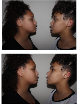
For my photo shoot for my middle pages I wanted both of my sisters to look at each other seriously. I experimented with the distance between both of my models and the shot, whether it should be a medium close up or just a close up. I wanted Amy and Ayeshia to be the same level to show that they are equal. I also really like the shadow under their faces because I feel that it gives it more of a serious tension between the two. Whilst looking at these photo's I released that the image where Amy and Ayeshia are more close together(image 2) will not work out as there is no space for me to put my story as I want the writing in between them. I think that images 4,5,6 and 7 are the best as the height between both of them are equal as I wanted. Especially in image 4,6 and 7 I think that both Amy and Ayeshia look more serious and they are the best images to use.
Monday, 7 December 2015
My Photo Shoot For My Front Cover
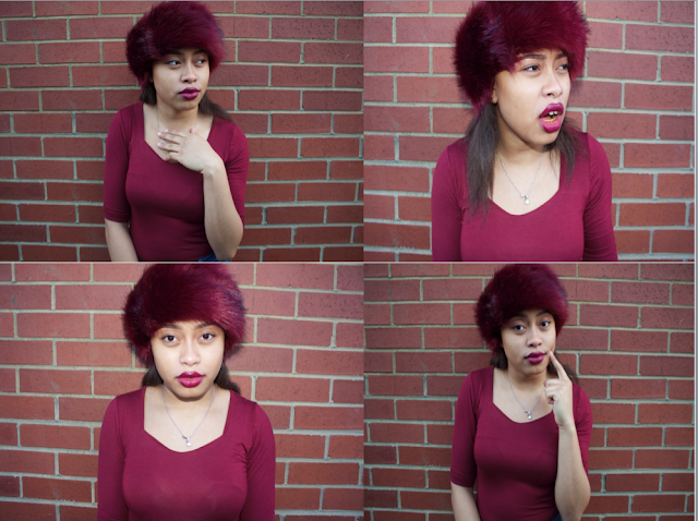
Here are some pictures I took for my main image on my magazine cover. I did not want to change the angle, I only used medium close up and close up as this is one of the conventions of R&B and hip-hop magazine covers. I also made my model experiment with different facial expressions and poses. In all of the images I wanted Amy (my model) to open her mouth to show her grills and I wanted her to give the audience the thought that Amy has a attitude that she does not care about most things and that nothing affects. I wanted a plain background so it will help my model to stand out from the front cover, I decided to dress my model in a black top as the background is white and black is a opposite colour to white. Whilst researching R&B and hip-hop magazine covers one of the conventions of women where them wearing not a lot of clothing and having a lot on show, which this represents women as being an object. But I want to go against this, I want women in my magazine to be shown to my audience as being powerful and successful as well as being equal to males within the R&B and hip-hop genre.
Thursday, 3 December 2015
Sketch Of Photo Shoot
Tuesday, 1 December 2015
Sketch Of My Middle Pages
Here I have produced a sketch of my rough idea of how I would like my final middle page to look. I have labelled some parts of the my sketch and explained them in more detail.
Sketch Of My Magazine Cover
Here I produced a sketch of an rough idea of how i would like my magazine cover to look. I have labelled some elements on this sketch to outline why it is like this.
Monday, 30 November 2015
Product Analysis&Target Audience Profile
Here I have produce two tables the top one is my magazine analysis. this gives an idea of what is going to be including into my magazine, the advertisement,the cost of my magazine, features and more. the table below contains the demographic and psychographics of my target audience. this is to help me find out ways that I can appeal my magazine to them. For example: my target audience use social media like; Facebook and snapchat then I will ensure that my magazine will be advertised on these social sites.
Thursday, 19 November 2015
Target Audience Profile Research
Monday, 16 November 2015
Experimenting with different fonts for my masthead
i have chosen to call my magazine grills as this was the popular choice to call my magazine. Here i have used experimented with different fonts to see what one is the best. i would like my masthead to be bold and catchy, to help my magazine stand out and reach to my audience easily.
Thursday, 12 November 2015
Masthead ideas for my music magazine cover
I have some ideas for what I would like my masthead for my
music magazine to be called.
Explode- this is a term used to describe something that has
burst rapidly. So this title name will connote that my magazine will burst of a
lot of information about R&B music and well-known artists.
Bars – this term is mostly used by urban individuals. It is
associated with music, it is a line or more of a specific song that they know
or they take the bass of a song and make up their own lyrics “bars”.
Grills- A grill is a type of jewellery that is worn over
teeth; this is very popular within the R&B and hip-hop culture. If the
model of my main image was wearing grills this will give my audience a clear
idea that the magazine is going to be about the R&B genre.
Explicit- this word is use to describe something that is
fully and clearly expressed. This will tell my audience that the magazine issue
is going to include a lot of information about music. This word is also used to
describe some music lyrics and videos. R&B and hip-hop do tend to have
explicit lyrics that contain strong language and image that reference to
inappropriate behavior. So my target audience will find the word familiar.
B*tches – this word is used a lot in R&B and hip-hop
songs. If my audience saw this word on
magazine covers they would find it appealing as the word is maybe what they use
and they hear it a lot in R&B and hip-hop songs.Thursday, 5 November 2015
Research of R&B magazine covers
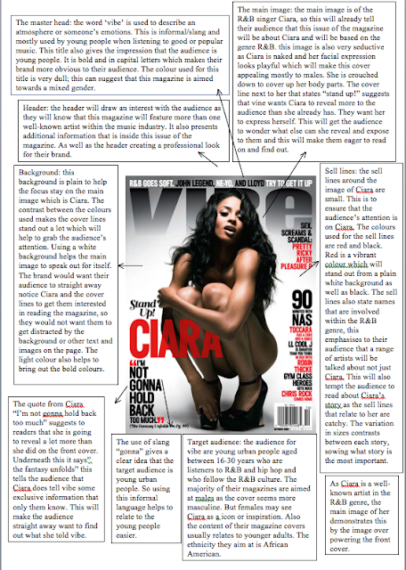
For my music magazine research i have created a mood board with lots of R&B magazine covers. I have choose R&B genre as I like how the magazine covers look and the layout of the magazine covers.
My School Magazine Cover
Here is my magazine cover. I decided to get a medium close up of Zebie and i wanted her to on the right side of the magazine cover. i did this because i wanted the camera to focus on Zebie and the background to be blurry. i added a image of my school, so this will give my audience the idea that my magazine relates to them as it is about them and school life. below my masthead i decided to put the slogan in different vibrant colours to make it stand out more to my audience. i wanted my magazine cover to be vibrant and colourful as my audience is to young people.
My School Content Page
This is my content page for my school magazine. I did i simple layout, so it would be easy for my audience to read and understand. I added photo's that relate to the contents. i am happy with my layout of my content page as it is neat, looks professional in a way. Elements on the page are not every where. However i am not happy with the colours that I used on my content page. as my audience is at young people the colours I think that the colours I should of used should of been vibrant and colourful, but I used dull colours. As using dull colours will help the images and the text on my content page stand out more to my audience.
Monday, 2 November 2015
Ideas for my title of my magazine
cover
Here are some of my ideas for how I would like
my magazine title to look. I have
decided to pick the first idea as it will help my magazine to appeal to my
audience easily. The title is very bold and clear and it will stand out to my
audience. The contrast between the colours black and white used for the title
also helps my title to catch my audience’s attention. The font I have used is
accent SF and the size is 72.
SUCCESS.
Wednesday, 28 October 2015
Sketch of my school magazine cover
Here is a sketch of my school magazine cover to be called “success”. I choose this word because I think that it will help relate to my audience easier. The audience for my magazine cover is teenagers who are still in education and who are going through their exams. When my audience first see my magazine cover I would want them to see the title “success”. This will make them want to buy my magazine as they will know that straight away my magazine will give them advice of how to be successful with their exams. The secondary images will be of children in their uniform, to signify to readers that the magazine is based about school. The other secondary image will be of the school building, again to help readers know that my magazine is to them. My slogan “believe, achieve, succeed”. I chose this slogan as it is abrupt and catchy. This will help my audience to remember the slogan.
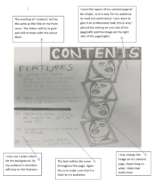
Below this is a sketch of how I would like my content page to look. the layout page of my content page is very simple and neat. I feel that this will make it more clear for my audience to understand and read. on this page there will include four images that will relate to the topics. the topics will be all events that relate to school e.g. revision tips, school curriculum and more.
School magazine cover research
On the magazine cover above, the contrast between the colours blue and white help the title to stand out. It is bold and helps the title to be more recognizable. The title of the magazine cover ‘Academy’ is spelt with a lower case A; this can be informal having the first letter of the word with no capital letter. This tells us that the magazine is trying to appeal to a younger audience; it also does not look very professional. The main colour of this magazine cover is blue; this includes the top and the bottom border line of the colour as well as the student’s uniform. This colour symbolises wisdom, confidence and intelligence. This suggests that the school as being full of students who are wise, confident and intelligent. Overall this will show the school as a good school.
It is obvious that both of the magazine covers are school
magazines. On the magazine cover below, the main image is of a girl wearing
school uniform: blouse, tie and blazer. The audience will notice straight away
that the girl is wearing uniform and feel that the magazine somehow has got
something to do with their age range. The cover lines in this magazine also
relate to school life such as: ‘GCSE results’, in school young people from
everywhere around the age of 16 will be doing their GCSE’s. in this magazine
cover the headline ‘teenage stress’ will get young people’s attention straight
away as they will be stressed with their exams and other situations that
teenagers go through, so this will make the readers feel as if they can relate
to this headline which will result them into reading the magazine more. The colour
yellow symbolises joy and happiness but it does not go with the word ‘stress’.
However the writer could have used yellow because this colour is very vibrant,
so it will help to point out the main topic that the magazine is going to be
based about. This bright colour will also attract the audience to the magazine.
Subscribe to:
Comments (Atom)


