Tuesday, 8 December 2015
My Photo Shot For My Content Page
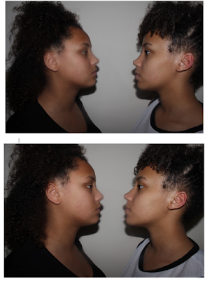
For my content page I wanted my images to be a close up of my model (Ayeshia) and I will use the same image four times. I prefer the image below as it shows her full face and I feel that it shows her expression for music better. I did experiment with different facial expressions of Ayeshia singing but unfortunately those photo's got lost. So I will be using the image at the bottom for my content page.
My Photo Shoot For My Middle Pages
For my photo shoot for my middle pages I wanted both of my sisters to look at each other seriously. I experimented with the distance between both of my models and the shot, whether it should be a medium close up or just a close up. I wanted Amy and Ayeshia to be the same level to show that they are equal. I also really like the shadow under their faces because I feel that it gives it more of a serious tension between the two. Whilst looking at these photo's I released that the image where Amy and Ayeshia are more close together(image 2) will not work out as there is no space for me to put my story as I want the writing in between them. I think that images 4,5,6 and 7 are the best as the height between both of them are equal as I wanted. Especially in image 4,6 and 7 I think that both Amy and Ayeshia look more serious and they are the best images to use.
Monday, 7 December 2015
My Photo Shoot For My Front Cover
Here are some pictures I took for my main image on my magazine cover. I did not want to change the angle, I only used medium close up and close up as this is one of the conventions of R&B and hip-hop magazine covers. I also made my model experiment with different facial expressions and poses. In all of the images I wanted Amy (my model) to open her mouth to show her grills and I wanted her to give the audience the thought that Amy has a attitude that she does not care about most things and that nothing affects. I wanted a plain background so it will help my model to stand out from the front cover, I decided to dress my model in a black top as the background is white and black is a opposite colour to white. Whilst researching R&B and hip-hop magazine covers one of the conventions of women where them wearing not a lot of clothing and having a lot on show, which this represents women as being an object. But I want to go against this, I want women in my magazine to be shown to my audience as being powerful and successful as well as being equal to males within the R&B and hip-hop genre.
Thursday, 3 December 2015
Sketch Of Photo Shoot
Tuesday, 1 December 2015
Sketch Of My Middle Pages
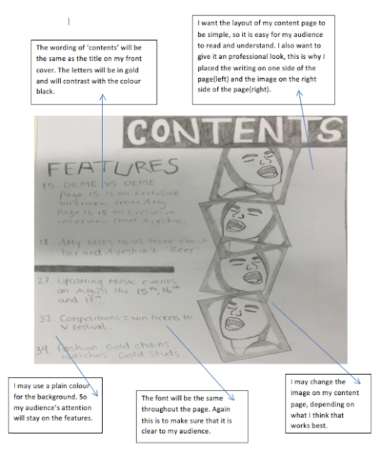
Here I have produced a sketch of my rough idea of how I would like my final middle page to look. I have labelled some parts of the my sketch and explained them in more detail.
Sketch Of My Magazine Cover
Here I produced a sketch of an rough idea of how i would like my magazine cover to look. I have labelled some elements on this sketch to outline why it is like this.
Subscribe to:
Comments (Atom)


